Friday, March 25, 2011

Daily Dose of My Art: Six-Part Continuous Panel Work in Progress

 So I was looking though my basement cabinet the other day and I found some old heavy duty card stock paper that had been cut into strips that were about 5" x15", and I decided to start drawing on them. Through the process of drawing I decided that I wanted to see if I could design a continuous modular panel of sorts (similar to a puzzle I had when i was younger that had no edges and you could arrange it however you liked because the finished right side would always be a match for the finished left side, and the same for the top and bottom). In this case I wanted to design panels that could stand alone if you wanted them to, or you could arrange them in order so that the last panel would always line up with first panel....or you could hang them completely mixed up and see if people realize that the drawings correspond to each other. Either way I'm excited about this project, and here are some pictures that show my work so far on it.

See the updated work in progress as of 4/6/11: Twisted Vine Designs: Daily Dose of My Art: Six-Part Continuous Panel Work in Progress: UPDATE
 

3/18/2011 6-part panel (of sorts) Work in Progress
panel 1,2, and the to be drawn upon remaining 4 "panels"
eventually the right side of the 6th panel will correspond to the left side of the 1st panel

 Panel 1 & Panel 2
3/18/2011 panel 1 and panel 2 (work in progress)
eventually the right side of the 6th panel will correspond to the left side of the 1st panel

Close up of the bottom parts of  the first 2 panels

Close up the Jellyfish in panel 1...He still needs some big refinements for instance he currently seems to be suffering from a slight case of polydactyly with his central tentacles , but this is just the initial drawing....
Another Close up of panel 1

Derby - If Ever There's a Reason (music video)


So if you can't tell from this post and the previous one, I'm kinda obsessed with the music in the go, do , explore car commercials :)

Music: Jonsi - Go Do

Thursday, March 24, 2011

Architectural inspiration from an apple peel

So this is my original architectural inspiration of the day: Imagine a long curling cascading apple peel, arrange, overlap, suspend the peel any which way you please, design a building/structure/or anything really based on that apple peel.
I fully plan on doing this when I have some free time after this semester is over, however my time is currently limited so I figured I would post it here so I will remember to do it! Feel free to use this concept to influence your own design project, and if you do, send the a picture of it to me, I would love to see how this inspires other people :)


Wednesday, March 23, 2011

Friday, March 18, 2011

Newest musical obsession: Bibio

Loving this right now, such happy music :)


This link will bring you to the soundcloud website with the song: K is for Kelson, by  Bibio


 This is a sampler of bibio's album "mind bokeh"


Newest musical obsession? I think so..

Thursday, March 17, 2011

Ray Lamontagne - Empty (song and lyrics)


I am so excited that I will be seeing him at bonnaroo this summer! (although technically I have seen him perform before when he was one of the openers for Guster back in 2006 at wolftrap, but I hadnt heard his musci at that point yet)

Sunday, March 13, 2011

Daily Dose of My Art: Jellyfish Hybrid...or Exploding bowl of noodles?

I drew this almost a year ago (3/20/2010) and I still love it because no matter which way you orient it, it still looks cool, and might even turn into something completely different than what I drew!

The original jellyfish (hybrid jellyfish octopus perhaps?) I drew, in the orientation that I drew it at.


Same drawing rotated 180 degrees. turns into an exploding bowl of noodles.
Same drawing except with the background digitally changed to purple.

Friday, March 11, 2011

Daily Dose of My Art: The Spaces In Between

In my previous blog entry The last drawing talked about the importance of balancing the amount and the placement of the "empty space" in your drawing. In the drawing below you can see 3 distinct "empty spaces. Those 3 "empty spaces" were the first 3 things I drew when I started this drawing. Everything that was drawn afterward was based off of those spaces in an effort to define and elaborate on a seemingly blank space. As a result the blank spaces actually become the focal point of this drawing, and in essence, shows that sometimes it is what you don't draw that actually makes the drawing stand out.
"The Spaces In Between" (3/29/2010- 4/4/2010) Concept: Design around a space

Daily Dose of My Art: I love my 11 x 14 drawing pad!

Here are some drawings and works in progress from my 11x14 drawing pad. I 'm loving the freedom that the larger paper size  is allowing me in my drawings.


Colored pencil drawing ( 7/1/2010) experimenting with blending the colors a bit
"The Serpentine Forest" (1/31/2011) I love how this turned out, but i need to add some color to it eventually
"The Serpentine Forest" (1/31/2011) playing with the exposure a little bit with my ridiculously sub-par roxio photsuite. uggg I need my photoshop back/relearn how to use it for drawings instead of photography. summer project perhaps?

"The Serpentine Forest" (1/31/2011) experimenting with adding color (with the ridiculously sub-par roxio photsuite.) I really want to add some darker brown and perhaps some highlights of  dark purple and red. not sure yet.

"The Serpentine Forest" (1/31/2011) experimenting with adding color (with the ridiculously sub-par roxio photsuite.) I added  some of the darker brown but I havnt gotten around to the  highlights of  dark purple and red. The crappy software is annoying me so I will probably return to this drawing when i get photshop back on my computer again.

Work in progress (2/4/2011) I have since added to it but I haven't taken a picture of the additions yet. The concept with this drawing, ( which is odd in itself because I hardly ever draw with a concept, I usually start with a line and work off of it and let the drawing evolve on its own), was that the top part of the drawing on the left was going to be some weird tree thing with an elaborate organic abstract root system below it. it kinda happened...ish...
Work in progress (2/4/2011) I have since added to it but I haven't taken a picture of the additions yet. The concept with this drawing, ( which is odd in itself because I hardly ever draw with a concept, I usually start with a line and work off of it and let the drawing evolve on its own), was that the top part of the drawing on the left was going to be some weird tree thing with an elaborate organic abstract root system below it. it kinda happened...ish...In this picture I messed with the exposure levels to get a darker picture and come up with some color scheme ideas.
Work in Progress (2/6/2011) Very similar style to yesterdays blog post. Started this drawing off in pen, switched to pencil in order to not overdraw this as the design got more complex. (Overdrawing can be easily done if you are not careful and all the intricate details that you worked so hard on would get lost in the drawing because you forgot about the subtle power of empty white space in a drawing and how it can either make or break a drawing.)  I apologize for that doozy of a run-on sentence, and I will post a drawing of mine that was drawn for the purpose of showcasing the power of the empty space.

Daily Dose of My Art

Here are some of the drawings that i have been editing recently, I think that this print would look amazing on a the side of a shirt. what do you think?:

This is the preliminary  pen drawing that i scanned in and experimented on color schemes with (see below) I have since added to the pen drawing (see the next drawing) 

This (ignore the pencil drawn flower on the right) is the Final version of the pen drawing. It will be colored in digitally (using one of the color schemes below) once I find a scanner that is big enough for it, this scan cut off a little from the top and bottom.
this color scheme is a bit floral and feminine which stands out nicely on the white background

Same floral and feminine color scheme which compliments the heather gray background

Same floral and feminine color scheme but this time it is paired with a lilac background


a little bit more earthy, masculine color theme. added some splashes of light blue so it stands out a bit from the green background
Same earthy, masculine color theme. added some splashes of light blues as highlights that compliment the blue background
Same earthy, masculine color theme with some splashes of light blue as highlights so it stands out a bit from the green background. filled in the rest of the white in the drawing with the khaki color.

Same earthy, masculine color theme with some splashes of light blues as highlights that compliment the blue background. filled in the rest of the white in the drawing with the khaki color.

Friday, March 4, 2011

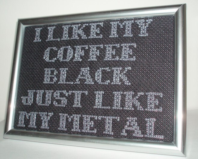
its the litttle things that entertain me

Oh Etsy, you never fail to amuse me, Mindless Self Indulgence lyric on  a cross stitch? why not? ahahahahha. ridiculous.  check out some more cross stitch stigma defying works at the etsy shop i found this at.